
So, You Used AI to Make Your Flyer. Now What?
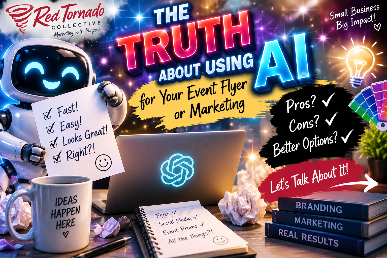
So, you used an AI-generated flyer to advertise your promotion or event.
You posted it.
And instead of getting people excited about what you were promoting, you got more slack than positive feedback.
People could tell it was AI. Your marketing agency is frustrated because they're pretty sure everyone thinks they designed it. And now you're wondering what exactly went wrong.
First: using AI wasn't necessarily the problem.
Look, we get it… we use AI, too. Isn’t everyone these days?
AI is a tool. And like any marketing tool, the quality of the result depends heavily on how you use it.
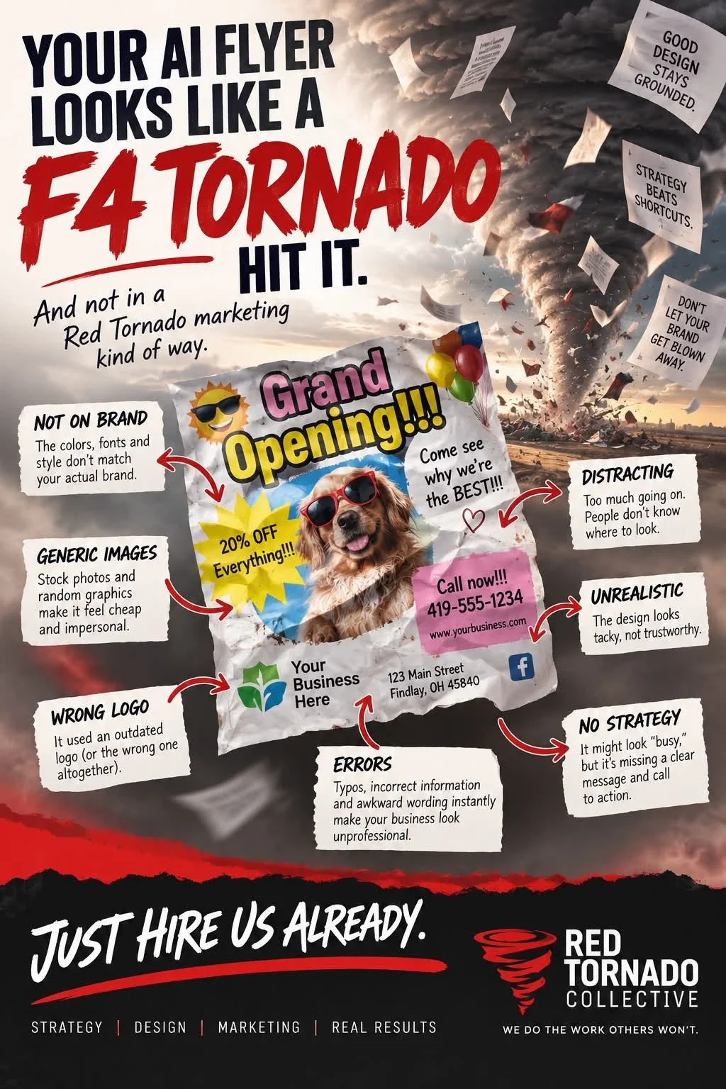
Give AI very little direction and it tends to give you... a lot.
Glowing text
Gradients on gradients
Random icons
Hearts, stars and sparkles everywhere
Too many fonts
Too many words
Decorative graphics filling every available space
Everything fighting to be the most important thing on the page
And somewhere in there is your logo, looking like it accidentally wandered into someone else's marketing.
That's what we're here to fix.
We're not going to spend this entire blog telling you your AI flyer looks terrible and that you should have hired us.
Would we love to design it for you? Absolutely.
But we also understand that hiring a marketing agency, even an affordable one like Red Tornado Collective, isn't always in the budget.
If AI is the tool you have available, we'd rather teach you how to use it better.
Why Is Your AI Marketing Getting So Much Slack?
1. Everyone can tell it's AI.
You're probably not fooling anyone.
AI-generated marketing has developed a pretty recognizable look. Think:
Over-the-top lighting and glows
Unnecessary 3D effects
Excessive graphics
Strange typography
Perfect-looking people (or really weird looking people!! haha)
Random decorative elements
Way too much happening at once
Using AI isn't inherently bad.
The problem starts when people notice the tool before they notice your message.
If someone is thinking, "Oh, that's AI," instead of "I want to attend that event," your marketing isn't doing its job.
2. It's often too busy.
Good graphic design doesn't mean filling every available inch. It means intentionally directing someone's attention.
A good event flyer should answer the important questions almost immediately:
What is it?
When is it?
Where is it?
What should I do next?
Everything else is secondary. Whitespace isn't wasted space.
3. It's probably not on brand.
Adding your logo to an AI-generated design doesn't automatically make it branded.
Your marketing should consistently use your:
Logo
Colors
Fonts
Photography style
Messaging
Overall visual personality
Consistency creates recognition.
If every flyer looks like it belongs to a completely different company, you're making it harder for people to recognize yours.
4. It can make your business look cheap.
This one might sting.
You can have an incredible company, professional employees and years of experience, but a cluttered, obviously AI-generated marketing piece can become part of someone's first impression of your business.
Marketing affects perception. If the marketing looks thrown together, some people may assume the business is, too.
5. It can make your marketing partners look bad.
This is one we feel pretty strongly about.
If you already work with a marketing agency or graphic designer and suddenly post something completely outside your established brand, people don't know who created it.
They may assume we did. And the last thing we want is someone looking at a piece of off-brand AI slop and thinking:
"Red Tornado made that?" 😂 Please don't do that to us.
More importantly, your marketing partner has probably spent significant time building consistency around your logo, colors, fonts, messaging and overall identity.
Protect that investment.
6. AI doesn't automatically understand what's important.
Your event name, date, sponsor list and disclaimer should not all be screaming at the same volume.
Good design uses visual hierarchy to tell your eyes where to go:
What's happening?
When and where?
Why should I care?
What should I do next?
AI can create hierarchy. But you may need to explicitly tell it what matters most.
7. It can also be wrong.
AI-generated doesn't mean proofread.
Before publishing, check:
Spelling
Dates
Times
Addresses
URLs
Phone numbers
Logos
Faces and hands
Fine-print details
Never assume polished means accurate.
And Yes, Platforms Are Paying Attention to AI Content
There's another reason not to assume nobody will notice.
Major platforms are increasing transparency around AI-generated media. For example, Meta uses “AI info” labels on certain Facebook and Instagram content when it detects industry-standard AI signals or when creators disclose AI use. Meta has also expanded transparency around AI used in advertising.
Google has similarly introduced AI disclosures for advertising, including ways for advertisers to disclose AI-generated or AI-edited assets and additional transparency about how some ads were made.
One important clarification: using AI does not automatically mean your content or ad will be rejected. AI-generated advertising is still evaluated under the platform's advertising policies. Misleading or otherwise policy-violating content can be rejected, but simply using AI isn't automatically a violation.
The takeaway? The days of assuming nobody will know you used AI are ending.
Don't focus on hiding it. Focus on using it well.
Whatever it is, the way you tell your story online can make all the difference.
Can't Afford Professional Design Yet? Do This Instead.
This is where we're going to stop giving you slack and actually help. 😉
Step 1: Teach AI Your Brand
Before asking it to design anything…
give it:
Your actual logo
Your brand colors, including HEX codes
Your fonts
Brand guidelines, if you have them
Examples of existing marketing you like
Then tell it:
“These are established brand standards. The design should complement them, not reinterpret them.”
Step 2: Give AI a Job
Don't just say:
"Make me a flyer for our fall festival."
Tell it what expertise you expect:
“Act as an experienced professional graphic designer specializing in event marketing. You understand visual hierarchy, typography, whitespace, readability, brand consistency and how people quickly process advertising.”
You're giving AI context before giving it an assignment.
Step 3: Tell It What NOT to Do
Seriously. This matters.
Tell it:
No glows
No excessive gradients
No unnecessary hearts, stars or sparkles
No clip-art appearance
No random icons
No excessive fonts
No filling empty space just because it's empty
No altering your logo
Minimal words
Generous whitespace
Clean, professional layout
AI needs boundaries.
Step 4: Establish the Hierarchy
Tell AI exactly what's most important.
For example:
PRIMARY: Fall Fest
SECONDARY: October 17 | 5–8 PM
THIRD: Downtown Findlay
CTA: Register at example.com
SUPPORTING: Food • Music • Family Activities
Then tell it:
“The supporting information should never visually compete with the primary message.”
Step 5: When You Think It's Finished, Ask for Less
This might be our favorite trick.
Instead of asking AI to add more, tell it:
“Simplify this design by approximately 30%. Increase whitespace. Remove decorative elements that don't communicate useful information. Make the primary message understandable within three seconds.”
Less is usually your friend.
Use these AI Graphic Design Prompts
Try these prompts:
Act as an experienced professional graphic designer specializing in [event marketing/industry]. You understand visual hierarchy, typography, whitespace, readability and brand consistency.
Create a [flyer/social graphic/postcard] for [PURPOSE].
Use the logo, brand colors and fonts I've provided. Do not alter or reinterpret my logo.
Primary message: [MESSAGE]
Secondary information: [DETAILS]
Call to action: [CTA]Create a clean, professional design with strong visual hierarchy and generous whitespace. Keep wording to the minimum necessary.
Avoid excessive gradients, glows, shadows, decorative icons, clip art, floating graphics, hearts, stars, sparkles and unnecessary filler. Do not add visual elements simply because there is empty space. Avoid excessive fonts, colors or competing elements.
Someone should understand the primary message within approximately three seconds.
Before creating the final design, identify the most important information, establish the visual hierarchy and remove anything that doesn't help communicate the message.
Then proofread everything it gives you.
AI Isn't the Problem. Bad Marketing Is.
We'd love for every small business and nonprofit to have the budget to work with professional marketers and designers.
That's not reality.
And our goal at Red Tornado isn't to make you feel bad because you aren't ready to hire us.
Our goal is to help you make better marketing decisions.
So if AI is the tool you can afford right now:
Use it.
Teach it your brand.
Give it boundaries.
Keep your message simple.
Proofread the result.
And don't mistake more design for better design.
The goal isn't to create something that looks impressive.
The goal is to communicate clearly.
And if you've done all of that and your flyer still looks like an F4 tornado hit it, and not in a Red Tornado marketing kind of way...
Just hire us already. 🌪️